
Flutter is awesome in that with just a one line of code, you get this nicely styled default AppBar with the back navigation button all build in for you.
appBar: AppBar( title: Text("Credit Cash"),),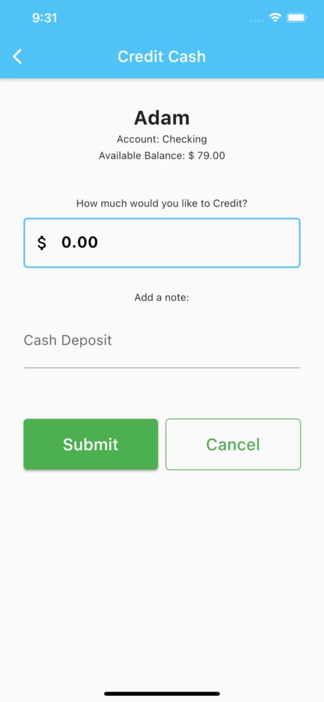
Change the AppBar Leading Icon
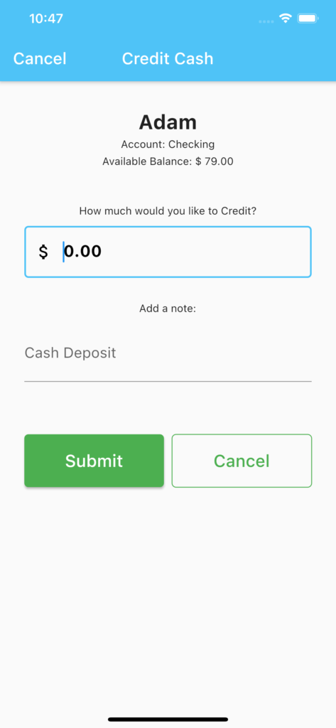
However, what happens if we want to change the back-arrow icon to something else like “Cancel” text?
appBar: AppBar(
        leading: Padding(
          padding: const EdgeInsets.all(8.0),
          child: Align(child: Text("Cancel"), alignment: Alignment.center,),
        ),
        title: Text(" Credit Cash"),
      ),
You will see that this seemingly easy idea become almost impossible to achieve because the width of the leading icon space is fixed in the default appBar.

Use a Row Widget
You might think that we could just create a Row Widget for the title instead. First, we set automaticallyImplyLeading to false and add a Row widget for the AppBar title.
AppBar(
        automaticallyImplyLeading: false,
        title: Row(
          mainAxisAlignment: MainAxisAlignment.start,
          children: [
            Text("Cancel"),
            Expanded(child: Align(child: Text("Credit Cash"), alignment: Alignment.center,)),

          ],
        ),
      ),
Hey, that seems to work! But if you look closely, you will see that the title is not centered across the width of the appBar. This is because Align will only center the Text across the width of the Text Widget.
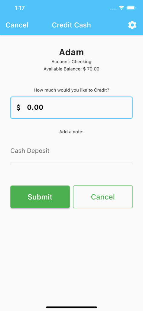
Use a Stack with the Row Widgets
To get around this alignment problem, we can use a Stack widget. Instead of a single row, we will now stack two Row widgets on top of each other. This way, we can center align the AppBar title independently of the leading Text widget.
appBar: AppBar(
        automaticallyImplyLeading: false,
        title: Stack(
          children: [
            Row(
              mainAxisAlignment: MainAxisAlignment.center,
              children: [
                Text(label+" Cash"),
              ],
            ),
            Row(
              mainAxisAlignment: MainAxisAlignment.spaceBetween,
              children: [
                InkWell(child: Text("Cancel"),
                onTap: (){
                  Navigator.pop(context);
                },),

              ],
            ),
          ],
        ),
      ),
You can add trailing icons like so. We need to set the Stack alignment to AlignmentDirectional.center so that the text will remained center across the stack regardless of the size of the trailing icons.
appBar: AppBar(
        automaticallyImplyLeading: false,
        title: Stack(
          alignment: AlignmentDirectional.center ,
          children: [
            Row(
              mainAxisAlignment: MainAxisAlignment.spaceBetween,
              children: [
                InkWell(child: Text("Cancel"),
                onTap: (){
                  Navigator.pop(context);
                },),
                InkWell(child: Icon(Icons.settings, size: 30),
                  onTap: (){
                  },),
              ],
            ),
            Row(
              mainAxisAlignment: MainAxisAlignment.center,
              children: [
                Text("Credit Cash"),
              ],
            ),
          ],
        ),
      ),
PreferredSize Widget for more AppBar Customization
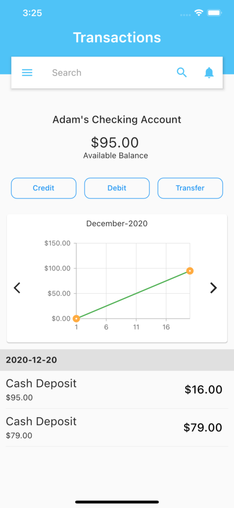
For more advance customization of AppBar in Flutter, we can use Stack with PreferredSize widget.
We pass in the AppBar().preferredSize.height as the default appBar height is different across different devices (eg: iPhone 8 Plus and iPhone 11 Pro Max). This way we don’t have to mess with the customized AppBar showing up differently across different devices.
 _appBar(height, appbarColor) => PreferredSize(
    preferredSize:  Size(MediaQuery.of(context).size.width, height+80 ),
    child: Stack(
      children: <Widget>[
        Container(     // Background
          child: Center(
            child: Text("Transactions", style: TextStyle(fontSize: 25.0,
                fontWeight: FontWeight.w600,
                color: Colors.white),),),
          color:appbarColor,
          height: height+75,
          width: MediaQuery.of(context).size.width,
        ),

        Container(),   // Required some widget in between to float AppBar

        Positioned(    // To take AppBar Size only
          top: 100.0,
          left: 20.0,
          right: 20.0,
          child: AppBar(
            backgroundColor: Colors.white,
            leading: Icon(Icons.menu, color: appbarColor,),
            primary: false,
            title: TextField(
                decoration: InputDecoration(
                    hintText: "Search",
                    border: InputBorder.none,
                    hintStyle: TextStyle(color: Colors.grey))),
            actions: <Widget>[
              IconButton(
                icon: Icon(Icons.search, color: appbarColor), onPressed: () {},),
              IconButton(icon: Icon(Icons.notifications, color: appbarColor),
                onPressed: () {},)
            ],
          ),
        )

      ],
    ),
  );

 @override
  Widget build(BuildContext context) {
    return Scaffold(
      appBar: _appBar(AppBar().preferredSize.height, Theme.of(context).primaryColor ),
      body: ListView(),
    );
})
Conclusion
As you can see, there are many ways to customize the AppBar in Flutter to meet your specific needs. I hope this post has been useful to give you some ideas in achieving that.