
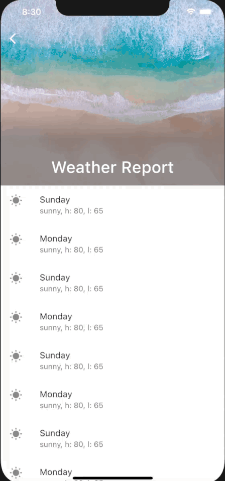
The SliverAppBar allows us to scroll the AppBar in Flutter to create the shrinking header effect like so.
SliverAppBar vs AppBar
The regular AppBar in Flutter is a fixed app bar that always remain above the body of the Scaffold. It is placed within the appBar property of a Scaffold.
Scaffold(
   appBar: AppBar( title: Text(label+" Cash"),),
   body: ListView(),
);
With the SliverAppBar, we move the app bar into a CustomScrollView in the body of Scaffold. Now SilverAppBar is only sliver of many other slivers that you can add to the body of the Scaffold.
In doing so, we can now allow the SliverAppBar to scroll off the screen of the device. The FlexibleSpaceBar property of the SliverAppBar expands and contracts to create the shrinking effect as we scroll through the app.
The expandedHeight property lets you determine how wide you want your SliverAppBar to be.
Scaffold(
body: CustomScrollView(
slivers: <Widget>[
SliverAppBar(
expandedHeight: 300.0,
flexibleSpace: FlexibleSpaceBar(
centerTitle: true,
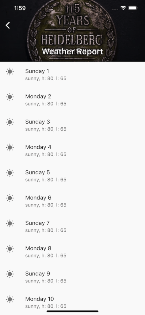
title: const Text('Weather Report'),
background: Image.asset(
'assets/images/unsplash.jpg',
fit: BoxFit.cover,
),
),
),
SliverList(
delegate: SliverChildListDelegate([
ListTile(
leading: Icon(Icons.wb_sunny),
title: Text('Sunday'),
subtitle: Text('sunny, h: 80, l: 65'),
),
ListTile(
leading: Icon(Icons.wb_sunny),
title: Text('Monday'),
subtitle: Text('sunny, h: 80, l: 65'),
),
ListTile(
leading: Icon(Icons.wb_sunny),
title: Text('Sunday'),
subtitle: Text('sunny, h: 80, l: 65'),
),
....
]),
),
],
),
);SliverAppBar Pin, Stretch & Float
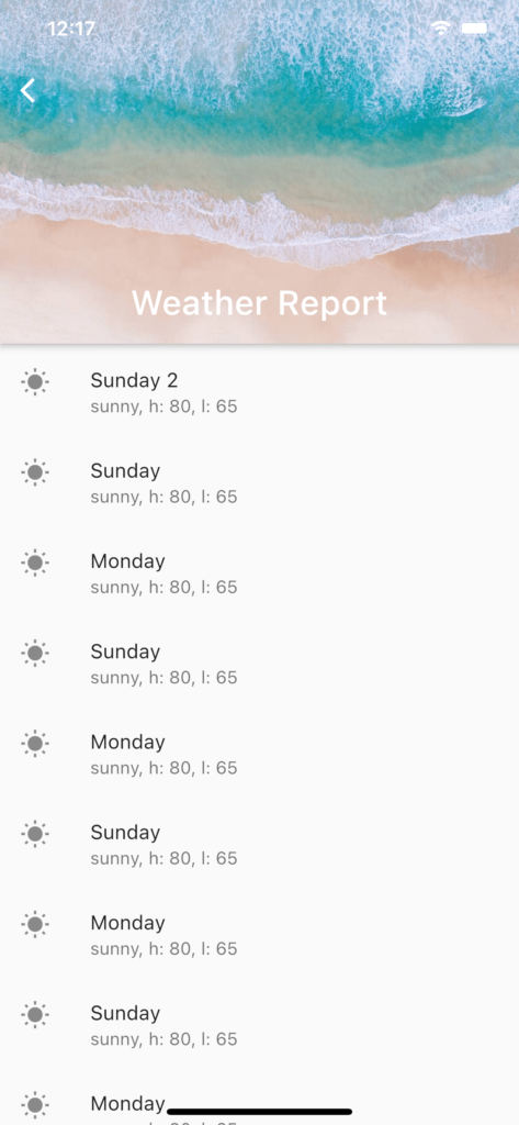
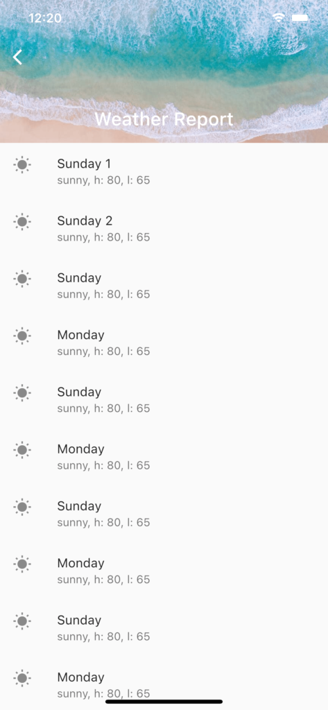
If you only want the SliverAppBar to collapse but not scroll off the screen, you can set the pin property to true.
If you want the SliverAppBar to show as soon as the user starts scrolling, you can set the float property to true. When float is set to true, as the user scrolls down, they will not be able to see item 1 of the list until the whole SliverAppBar has been full expanded.
On the other hand, when float is false (by default), the complete list will be shown as you scroll down before the SliverAppBar is expanded.

When float is set to true, the SliverAppBar is shown before the complete list. When float is set to false, the expanded SliverAppBar is not shown until the complete list is shown.
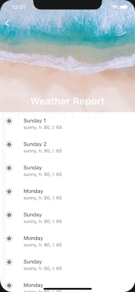
The stretch property allows you create a cool stretching effect like this as you scroll down your screen.
NestedScrollView to make SliverAppBar Fully Collapse for Short Lists
The problem with using a SliverAppBar inside a CustomScrollView is that when the list is too short, you cannot collapse the SliverAppBar at all.
If the list is longer than the screen but not long enough to fully collapse the SliverAppBar, you will be stuck with a half-collapsed SliverAppBar screen. Which looks pretty awkward, especially if you have logo as your background in the SliverAppBar.
To get around this problem, we take inspiration from Andrea Bizzotto ‘s use of NestedScrollView.
Instead of a single CustomScrollView, we now use NestedScrollView. First, we use the headerSliverBuilder for the AppBar. Next, we embed the CustomScrollView inside a Builder for the body of the NestedScrollView.
return Scaffold(
body: NestedScrollView(
headerSliverBuilder: (BuildContext context, bool innerBoxIsScrolled){
return <Widget>[
SliverOverlapAbsorber(
handle:
NestedScrollView.sliverOverlapAbsorberHandleFor(context),
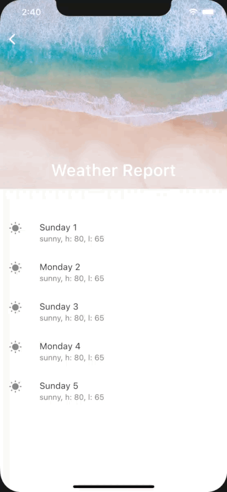
sliver: SliverAppBar(
pinned: true,
//floating: true,
stretch: true,
expandedHeight: 300.0,
flexibleSpace: FlexibleSpaceBar(
centerTitle: true,
title: const Text('Weather Report'),
background: Image.asset(
'assets/images/logo1.jpg',
fit: BoxFit.cover,
),
),
),
),
];
},
body: SafeArea(
child: Builder(
builder:(BuildContext context) {
return CustomScrollView(
slivers: <Widget>[
SliverOverlapInjector(
// This is the flip side of the SliverOverlapAbsorber above.
handle: NestedScrollView.sliverOverlapAbsorberHandleFor(
context),
),
SliverList(
delegate: SliverChildBuilderDelegate(
(BuildContext context, int i){
return ListTile(
leading: Icon(Icons.wb_sunny),
title: i%2 != 1 ? Text('Sunday ${i+1}') : Text('Monday ${i+1}'),
subtitle: Text('sunny, h: 80, l: 65'),
);
},
childCount: 5
),
),
],
);
}
),
),
),
);Now, our SliverAppBar collapse nicely even if the list is too short.
Conclusion
The SliverAppBar in Flutter is certainly one cool widget to add some interactivity and snazziness to your mobile app. If this has been useful for you, please let me know in the comments, I appreciate any feedbacks or questions that you may have.